


1. Introduction
It is commonly agreed that there is a need to gain insight into students’ perceptions and discover how they behave when dealing with assessment tasks that have different requirements. Teachers’ awareness of what and how learners are doing is important to assess learner progress.
Furthermore, it is important to build systems that will allow students to monitor their own progress, support self-regulated learning and help them evaluate and adjust their learning strategies to increase goal achievement. According to Economides (2005, p.1), “It would be useful for the examinees to know their current status in order to be challenged, stimulated, motivated, or to design their testing strategies”. It has been acknowledged that self-regulation assists the student to self-organize and maintain self-management during learning. “Self-regulation is not a mental ability or an academic performance skill; … it involves the self-awareness, self-motivation, and behavioural skill to implement that knowledge appropriately.” (Zimmerman, 2002, pp. 65-66).
In support of self-regulation, analytic dashboards with multiple student-generated data visualizations have been broadly adopted to enable teachers and students to reflect on their activity and compare it with their peers (Economides, 2005; Thomas & Cook, 2005). Visual representations translate data into a visible form that highlights important features, including commonalities and anomalies. They aim to shed light on how students learn, reveal learning habits and learner-strategy patterns, and provide a deeper understanding of learning mechanisms in general (e.g., Morris, Finnegan, & Wu, 2005; Macfadyen, & Dawson, 2010). Soller, Martinez, Jermann, & Muehlenbrock (2005) considered that visual analysis was a key enabler to gain insights into the learning process and provided a basis to support self-reflection, awareness and collaboration among learners or teachers. In a sense, visual representations of student-generated trace data help both students and instructors interpret them intuitively and perceive hidden aspects of these data quickly.
In this paper, we elaborate on the visualization of student-generated temporal trace data logged during assessment procedures. The goals of this study were twofold: a) to depict students’ engagement in the assessment procedure in terms of time spent and temporal factors associated with learning-specific characteristics, and b) to explore the factors that influence the teachers’ Behavioural Intention (BI) to use the proposed system as an information system and their perceptions of the effectiveness and acceptance of our approach. The proposed visualizations have been explored in a study with 32 Secondary Education teachers. We adopted a design-based research methodology and employed a survey instrument – based on the Learning Analytics Acceptance Model (LAAM) (Ali, Gašević, Jovanović, & Hatala, 2013) – in order to measure the expected impact of the proposed visualizations. The analysis of the findings indicates that a) temporal factors can be used for visualizing and outlining students’ behaviour during assessment, and b) the visualization of the temporal dimension of students’ behaviour increases teachers’ awareness of students’ progress, possible misconceptions (e.g., guessing the correct answer), effort needed and task difficulty.
The rest of the paper is organized as follows: in section 2, we briefly review existing work on the visualization of learning data for monitoring purposes. In section 3, we explain the motivation and rationale of our research. In section 4, we briefly describe the tools used for the purpose of our research, and in section 5 we present the methodology followed, the data collection procedure and the data analysis methods that we applied. In section 6, we analyze the results from the evaluation study. Finally, in section 7, we discuss the major findings and conclude with future implications.
2. Related Work
Learning dashboard visualizations are not new. These dashboards are used in traditional face-to-face teaching, online learning and blended learning settings. Duval (2011) prompted the question of how to model the relevant data that would then be used for the visualization of users’ interactions. The author suggested the Contextualized Attention Metadata (CAM) schema (Wolpers, Najjar, Verbert, & Duval, 2007), which defines a simple model to structure attention metadata, i.e., the interactions that people have with objects.
Based on this model, Govaerts, Verbert, and Duval (2011) presented Student Activity Meter (SAM), a visualization tool that focused on providing an overview of activities and resource use in a virtual classroom over time. SAM visualizes time spent on learning activities and resource use in online learning environments. The SAM tool aimed to enable both students and teachers to explore user activities and find patterns, contributing to awareness and self-monitoring. Like SAM, Gradient’s Learning Analytics System (GLASS) (Leony, Pardo, de la Fuente, de Castro, & Kloos, 2012) has adopted the CAM schema. It tracks the number and types of events and was developed to support both teachers and learners.
The Tool for Advanced Data Analysis in Education (TADA-Ed) aimed to assist educators in detecting pedagogically important patterns in students’ assignments (Merceron, & Yacef, 2005) by capturing frequencies of students’ mistakes, frequencies of concepts used erroneously, frequency of logins, etc. Further, CourseViz was developed to work with WebCT to visualize student-tracking data (Mazza, & Dimitrova, 2007). Similarly, Graphical Interactive Student Monitoring System (GISMO) (Mazza, & Milani, 2005) fetches students’ data from Moodle logs and performs some statistical calculations. It displays how and when students are engaging with Moodle activities and resources.
More recently, LOCO-Analyst (Ali et al., 2012) was developed as a learning analytics tool aimed at providing educators with feedback on the relevant aspects of the learning process taking place in a web-based learning environment. The generation of feedback in LOCO-Analyst is based on the analysis of user tracking data, including time spent, students’ interactions in discussion forums, interactions with the learning content, students’ annotations, etc.
3. Motivation of our research
From a more critical view on the above-mentioned related work, it can be seen that most of these tools try to assist educators in exploring social, cognitive, and behavioural insights of student activities in different learning systems. Although TADA-Ed uses simple frequencies of events, however, it presupposes that the users (i.e., teachers) are familiar with data mining techniques and competent enough to choose and apply them as well as to analyze their results, which can be quite complex. Moreover, the CourseViz tool representation lacks the ability to visualize the conversation flow and it is difficult to view the third dimension of the graph. In addition, GISMO was developed specifically for online learning courses and thus only collects data from within Moodle and consequently it is solely associated with this learning environment.
Furthermore, if we analyze dashboards, we find that time spent is a commonly captured trace. According to Govaerts et al. (2011, p.3) “time tracking information allows teachers to assess their initial time estimates with the real time spending of students and find the exercises that consume most time. Time tracking can help the learner to understand his time allocation compared to his peers and assist sometimes to report time spending to the teacher”. Moreover, Economides (2005) indicated a number of time-oriented graphs/plots for supporting students during Computerized Adaptive Testing procedures, including for example, the average/maximum/minimum time interval the class spent on each task/subtopic/topic, the average/maximum/minimum time interval the student spent on each task/subtopic/topic, etc.
Two cited examples of dashboards that exploit the time-spent factors are LOCO-Analyst and SAM, which both address the issue of being aware of “which resource I and others use”. Like SAM and LOCO-Analyst, the Temporal Learning Analytics Visualization (TLAV) tool also aims to visualize time spent on activities, but in contrast to these two (which visualize resource usage over time), TLAV focuses on the time aggregated according to the correctness of a submitted answer during an assessment procedure. In a sense, SAM and LOCO-Analyst use the time-spent factor to evaluate the resources and to provide related interesting learning material or contextualize social interactions among students accordingly. TLAV on the other hand, aims to identify guessing and slipping behaviour, to understand the effort needed by the students to cope with the assessment items and to evaluate the difficulty of these tasks respectively. This differentiates the way the temporal factors are explored in our research and provides additional capabilities in terms of understanding students’ learning behaviour in general.
Through the development of TLAV, we wanted to expand the capabilities and address some limitations of the earlier systems. Our intention was to provide instructors and students with a visualization tool that would be independent from any specific learning environment and that would provide feedback on the effort needed to solve each task and infer its difficulty level.
4. The Learning Analytics and Educational Recommender System (LAERS) assessment environment and the TLAV tool
The TLAV tool obtains the necessary temporal and performance indicators from the LAERS assessment environment (Papamitsiou & Economides, 2013), and it constitutes a part of this environment to be used by the instructors during the assessment procedures in order to monitor the students’ progress.
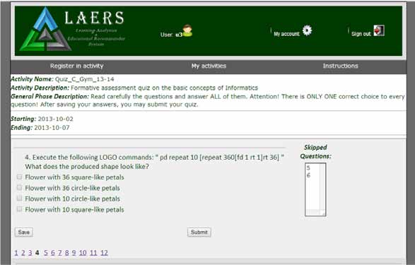
The LAERS environment consists of a testing mechanism and a tracker that logs students’ temporal data. The testing unit displays multiple-choice quiz questions delivered to students. The students can temporarily save their answers to the questions, change their initial choice, or skip a question and answer it (or not) later. If students choose not to answer a question, they receive zero points for this question. Figure 1 illustrates a student’s view of the environment during testing.
The tracker component of the system records students’ activity data during testing. Specifically, the tracker logs the following parameters for each student (collected dataset): student ID, the question the student works on, the answer the student submits, the correctness of the submitted answer, how many times the student views each question, how many times the student changes the answer, the timestamp the student starts viewing a question, the timestamp the student chooses to leave the question (saves an answer), the idle time the student spends viewing each question (not saving an answer, but choosing to see another question). In LAERS, Total_Time_to_Answer_Correct (TTAC) is the total time (aggregated) that a student spends on viewing the questions and submitting the correct answers to these questions. Respectively, Total_Time_to_Answer_Wrong (TTAW) is the total time (aggregated) that a student spends on viewing the questions and submitting the wrong answers to these questions.
Figure 1. The LAERS environment during testing
The system also calculates a) the Actual Performance (AP) for each student (i.e., the aggregated score and how it changes every time the student saves an answer, according to the correctness of the submitted choice. The student’s final score on the quiz is the latest value of AP when the student finishes the quiz), and b) average time values for each question and each student.
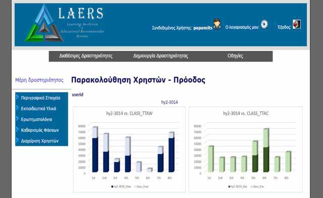
As stated before, TLAV obtains the temporal data and performance indicators from the LAERS system. Before analyzing the visualizations, it should be noted that these graphs are dynamic and change as the assessment procedure evolves and the students solve more tasks, capturing each student’s progress and the overall change of the class until that moment. In addition, the graphs are embedded in the LAERS assessment environment (Figure 2 – The LAERS assessment environment from the teacher’s view – progress monitoring) and are delivered to the end-user on demand.
Student data (i.e., login information, final answer submitted for each question and final score) and quiz data (i.e., quiz questions with possible answers, correct answer to each question) are stored on a database, while tracked activity data are stored on a log file. The whole system is developed in PHP 5.4, MySQL 5.1 and runs on Apache 2.4 for Windows. JavaScript, AJAX, JSON and JQuery have also been used for implementing the system’s functionalities.
Figure 2. Teacher’s view of the LAERS assessment environment – progress monitoring
5. Methodology
In this research, we firstly applied the design-based research methodology. This methodology relies on rapid prototyping to evaluate ideas in frequent, short iteration cycles (Anderson, & Shattuck, 2012). In our study, we used two iterations: one for the prototype development and one for the first evaluation with real users.
5.1. First iteration cycle: TLAV prototype development – Design and Implementation
During the first iteration, we collected requirements and identified potential usability issues regarding teachers’ perceptions of graph visualizations. Our goal was to design TLAV in order to support learners’ self-monitoring and teachers’ awareness. For that purpose, we asked a sample of 12 Secondary Education teachers (4 females and 8 males) to explain to us what they considered “useful” and “comprehensible” graphical representation. Based on their answers, we initially decided to use simple and clear graph visualizations, using bar charts and lines, in order to provide both students and instructors with an overview of the above-mentioned temporal factors, in a form that would be familiar to them. Moreover, the participating teachers considered it important to visualize the following information: the identification of guessing and slipping behaviour during assessment, the overall effort needed to cope with the assessment items and the inferred task difficulty. The graphs we decided to design and embed into the LAERS system are summarised in this section.
Before moving on to the presentation of the suggested visualization, we should mention that, during the prototyping phase, we used student-generated data that we had collected in previous experimentations with the LAERS environment for the graph design and construction. More precisely, these data were collected from a total of 96 participating students from a Greek High School, who attended the mid-term exams, from 2 to 7 October 2013. The 12 multiple choice questions in the test were about the basic concepts of Informatics. In the following presentation of the visualizations and for simplicity reasons, we have included only 29 randomly selected students and 8 questions.
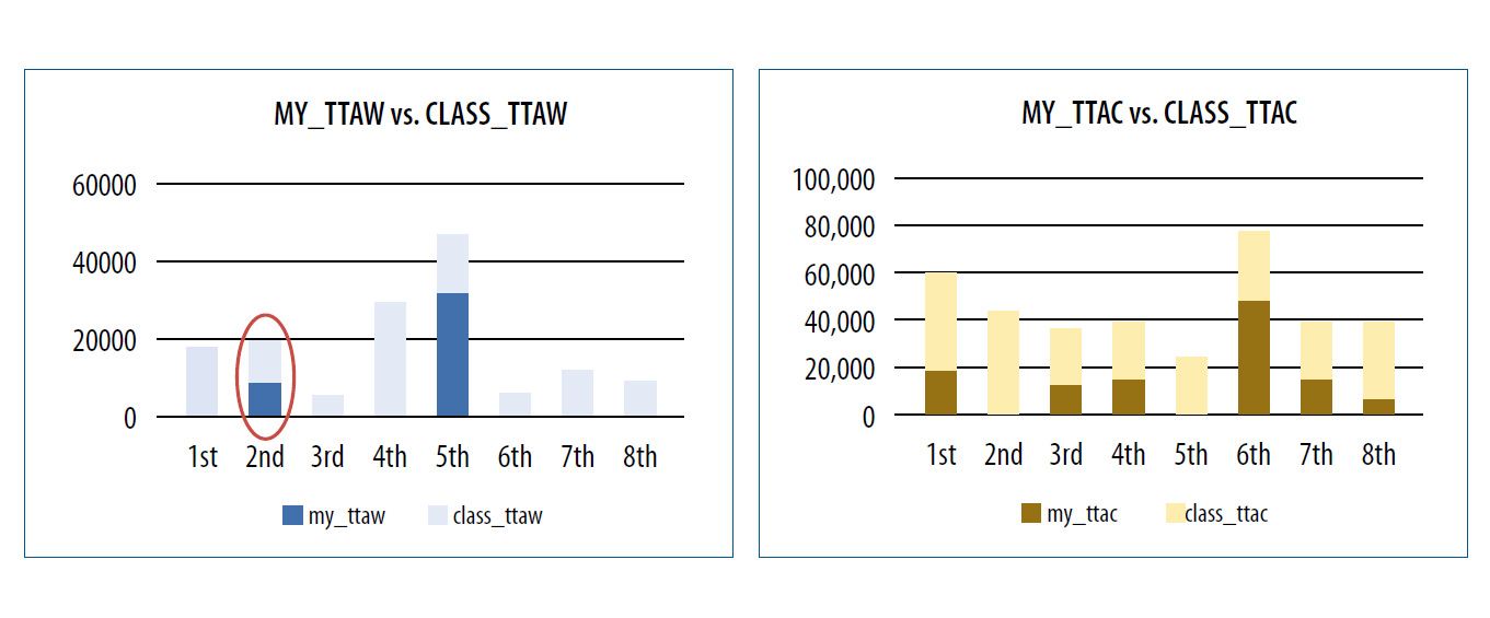
Every bar in Figure 3 (a) and (b) represents a student’s TTAW – blue bars – (TTAC – orange bars) in the assessment tasks, compared to the class’s average TTAW – light blue bars – (TTAC – light orange bars) in these tasks. The horizontal axis represents the assessment task, while the vertical axis represents the amount of time-spent. For example, this particular student spent a lot of TTAW on task 8, while the average student spent less time on that item. Moreover, this student spent a lot of TTAC on task 6, in alignment with the average student who also spent a lot of TTAC on the same task. In addition, from these graphs one can hypothesize the guessing/slipping behaviour of a student. For example, this student answers most of the questions wrongly, spending a lot of time to submit a wrong answer. However, this student quickly submits a correct answer to task 1, which the average student spends a lot of time to answer correctly. This could be an indication that in this particular task, the student has guessed the answer. On the contrary, Figure 4 (a) and (b) depicts the time spent by a student who answers most of the questions correctly and seems to spend little time to answer wrongly in task 2, which most students answered correctly. This is an indication of slipping behaviour.
Figure 3. Student’s TTAW vs. Class’s TTAW (a) – Student’s TTAC vs. Class’s TTAC (b)
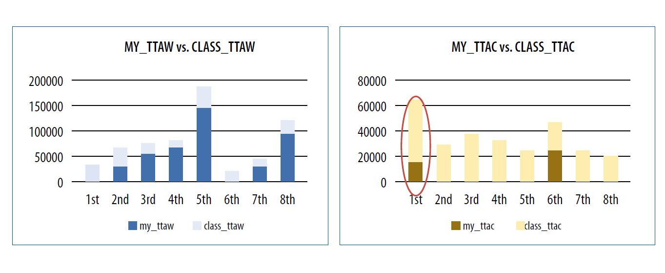
Figure 4. Student’s TTAW vs. Class’s TTAW (a) – Student’s TTAC vs. Class’s TTAC (b)
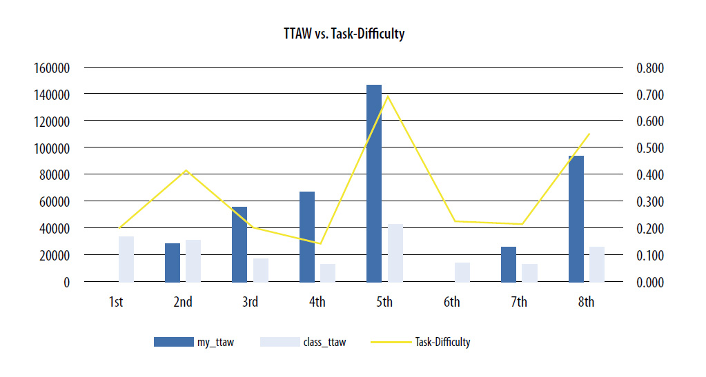
Moreover, Figure 5 displays how each student’s overall effort is associated to his/her actual performance in the assessment procedure. For example, student 25 tries hard to overcome the assessment (green line peak) and he/she achieves a high score (red line peak), while student 10 does not try hard enough and gets low score. Furthermore, Figure 6 illustrates a student’s TTAW compared to the average class TTAW and the estimated task difficulty of the assessment tasks. For example, the student spent a lot of TTAW on the 5th and 8th tasks, which are estimated to be difficult tasks (yellow line peak). Additionally, he/he spent a lot of TTAW on the 3rd and 4th tasks, which are estimated to be easier tasks. This hint is expected to inform the instructor, that this student has serious misconceptions, even in easy tasks.
Figure 5. Student’s effort vs. Actual Performance
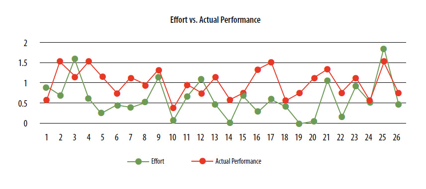
Figure 6. Student’s TTAW vs. Task Difficulty
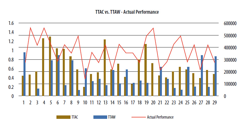
Then we wanted to have an overall comparison of all the students’ TTAC vs. TTAW, since these two factors have been found to be significant determinants of actual performance. The graph in Figure 7 displays this comparison with the actual performance curve.
Figure 7. Student’s TTAW vs. TTAC – with Actual Performance curve
5.2. Second Iteration Cycle: Evaluation of TLAVs – Research Model and Hypotheses
During the second iteration of our methodology, we asked 32 Secondary Education teachers (from two different Greek High Schools) to evaluate the TLAVs (18 males [56.3%] and 12 females [43.8%], aged 38-56 years old (M=45.56, SD=6.043, N=32), with expertise in different domains including Language teaching, History, Sociology, Mathematics, Physics, and Informatics). Of these, 12 (37.5%) had also participated in the first iteration cycle. The participants had prior teaching experience in Secondary Education varying from 6 to 30 years (M=15.66, SD=6.39, N=32) and exposure to online learning systems. The majority of participants (30 out of 32 [93.7%]) had Computer Science or Information Systems backgrounds – Certification in using information and communication technologies (ICT). Ten of the participants (31.2%) had previous exposure to similar visualizations (e.g., Google Analytics).
For evaluation purposes, we asked all participating teachers to access the LAERS environment and explore the visualizations provided by the TLAV tool for 30 minutes. The participants were given brief instructions regarding the use and functionalities of LAERS before accessing the environment. All of the participants screened the same visualizations and were aware and agreed on how AP was calculated. For this procedure, we used the same dataset as the one in the previous experiment (see section 5.1).
For evaluation purposes, we used the LAAM (Ali et al., 2013), which is based on the TAM (Davis, 1989). This has been put forward as a way of explaining the adoption of a learning analytics tool. LAAM states that Overall Usefulness perception (which is an extension of Usefulness from TAM) and Overall Ease of Use perception (which is an extension of Ease of Use from TAM) are determinants of BI to adopt the tool. In our study, we wanted to explore the participants’ BI to use the proposed visualizations and their perceptions of the overall usefulness of TLAVs regarding their capabilities in terms of improving the teachers’ awareness.
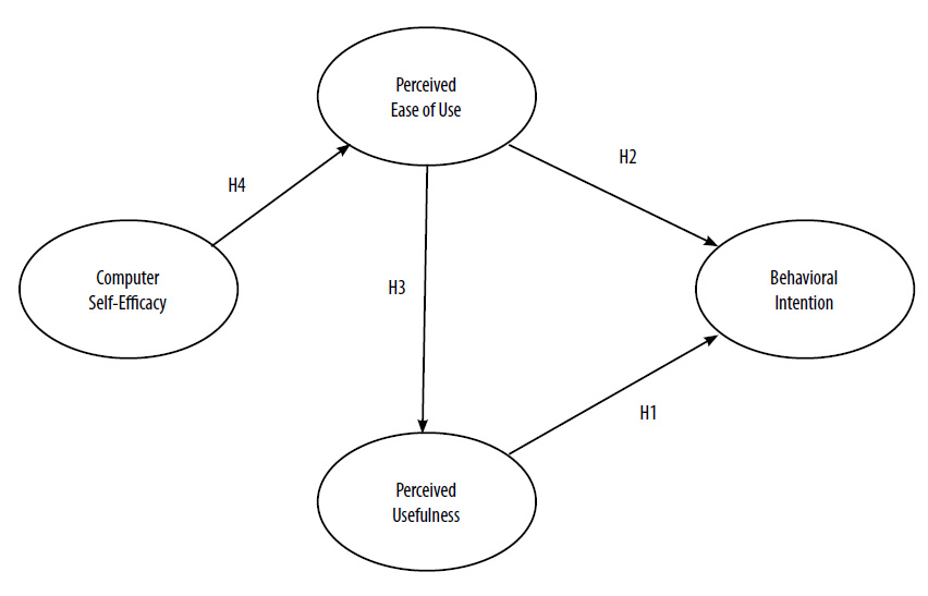
TAM posits that BI determines actual systems use. In fact, BI is an indication of an individual’s readiness to perform a given behaviour (Ajzen, 2002). Further, according to TAM, Perceived Usefulness (PU) is defined as the degree to which a person believes that using a particular system will enhance his/her job performance, and PEOU is the degree to which a person believes that using the system would be free of effort (Davis, 1989). Likewise, teachers may believe that TLAVs will increase their knowledge and comprehension of what their students know and will provide them with improved awareness. In our study, we also assumed that the teachers may believe that an easy to use visualization system could support them to identify students at-risk at an early stage and assist them with intervening accordingly. Therefore, we hypothesized:
- H1: Perceived Usefulness will have a positive effect on the Behavioural Intention to use TLAVs.
- H2: Perceived Ease of Use will have a positive effect on the Behavioural Intention to use TLAVs.
- H3: Perceived Ease of Use will have a positive effect on Perceived Usefulness.
Moreover, we decided to extend the LAAM by involving Computer Self-Efficacy (CSE) because previous results shown that a causal link exists between CSE and PEOU (e.g., Padilla-Melendez, Garrido-Moreno, & Del Aguila-Obra, 2008). CSE has been defined as the individual’s perceptions of his/her capacity to use computers (Compeau & Higgins, 1995). Regarding TLAV’s comprehension, CSE is an important factor, because users with high skill on using computer-based systems are expected to feel more comfortable with this kind of visual representations. Thus, we hypothesized that:
- H4: Computer Self-Efficacy will have a positive effect on Perceived Ease of Use.
To summarize, in this study we explore the causal model illustrated in Figure 8.
Figure 8. Research model and Hypotheses
5.3 Measures and Data analysis method
In order to examine the four latent constructs of the model, we adapted items based on previous studies. The respective items are summarized in Table 1. In particular, three items for PU, three items for PEOU and three items for BI to use were adopted were adopted from Davis (1989). For CSE, we used three items adapted from Compeau and Higgins (1995), which also have been used by other studies. To conclude, our measurement instrument consists of 12 items and our research model consists of four constructs. To measure these items, we used a seven-point Likert-type scale where 1 = strongly disagree and 7 = strongly agree.
In this study we used Partial Least-Squares (PLS) analysis for the construction of a path diagram that contains the structural and measurement model showing the causal dependencies between latent variables and the relations to their indicators (Chin, 1998). In PLS, the sample size has to be a) 10 times larger than the number of items for the most complex construct, and b) 10 times the largest number of independent variables impacting a dependent variable. In our model, all construct variables have three items. Further, the largest number of independent variables impacting a dependent variable is two (PE and PEOU to BI). Thus, the sample for our group (32) is large enough, since it surpasses the recommended value of 30 (Chin, 1998). Reliability and validity of the measurement model are proved by measuring the internal consistency (Cronbach’s a and Composite Reliability), convergent validity and discriminant validity (Average Variance Extracted-[AVE]) (Barclay, Higgins & Thompson, 1995). The structural model is evaluated by examining the variance measured (R2) by the antecedent constructs. Variance values equal to 0.02, 0.13 and 0.26 are considered as small, medium and large, respectively (Cohen, 1988). Moreover, a bootstrapping procedure is used in order to evaluate the significance of the path coefficients and total effects, by calculating t-values. In addition, Goodness of Fit (GoF) provides an overall prediction capability of the research model by taking into consideration the measurement and the structural models. GoF values of 0.10, 0.25 and 0.36 are defined as small, medium and large, respectively (Wetzels, Odekerken-Schröder & Van Oppen, 2009).
Table 1. The evaluation questionnaire
|
Perceived Usefulness of TLAV |
PU1. Using TLAVs in my school can increase my awareness of the class’s progress |
|---|---|
|
PU2. Using TLAVs can enhance my effectiveness in assessing my class |
|
|
PU3. I find TLAVs useful in my school |
|
|
Perceived Ease of Use |
PEOU1. Learning to use TLAVs is easy for me |
|
PEOU2. I find it easy to get what I need from TLAVs |
|
|
PEOU3. My interaction with TLAVs is clear and understandable |
|
|
Behavioural Intention to Use TLAV |
BI1. I plan to use TLAVs in the future |
|
BI2. I intend to continue using TLAVs in the future |
|
|
BI3. I predict I will try to use TLAVs to monitor my class, whenever I have the chance to do so |
|
|
Computer Self-Efficacy |
CSE 1. I could complete a job or task using a computer if someone showed me how to do it first |
|
CSE2. I was fully able to use a computer and the Internet before I began using the TLAVs |
|
|
CSE3. I could complete a job or task using a computer |
6. Results
Table 2 confirms the adequate values for the measurement model. This table shows the items’ reliabilities (Cronbach’s a, CR), AVE and factor loadings and confirms convergent validity.
Table 2. Results for the measurement model
|
Construct Items |
Factor Loading (>0.7)a |
Cronb. a (>0.7)a |
CR (>0.7)a |
AVE (>0.5)a |
|---|---|---|---|---|
|
CSE |
|
0.932 |
0.976 |
0.932 |
|
CSE1 |
0.948 |
|
|
|
|
CSE2 |
0.980 |
|
|
|
|
CSE3 |
0.967 |
|
|
|
|
PU |
|
0.801 |
0.923 |
0.801 |
|
PU1 |
0.885 |
|
|
|
|
PU2 |
0.887 |
|
|
|
|
PU3 |
0.913 |
|
|
|
|
PEOU |
|
0.829 |
0.936 |
0.829 |
|
PEOU1 |
0.870 |
|
|
|
|
PEOU2 |
0.930 |
|
|
|
|
PEOU3 |
0.931 |
|
|
|
|
BI |
|
0.790 |
0.918 |
0.790 |
|
BI1 |
0.900 |
|
|
|
|
BI2 |
0.853 |
|
|
|
|
BI3 |
0.911 |
|
|
|
a Indicates an acceptable level of reliability and validity
In addition, Table 3 shows the correlation matrix for the measurement model. The diagonal elements are the square root of the AVE of a construct. Discriminant validity is confirmed since the diagonal elements are higher than any correlation with another variable (according to the Fornell-Larcker criterion).
Table 3. Discriminant validity for the measurement model
|
Construct |
CSE |
PU |
PEOU |
BI |
|---|---|---|---|---|
|
CSE |
0.96 |
|
|
|
|
PU |
0.56 |
0.89 |
|
|
|
PEOU |
0.77 |
0.59 |
0.90 |
|
|
BI |
0.57 |
0.78 |
0.57 |
0.88 |
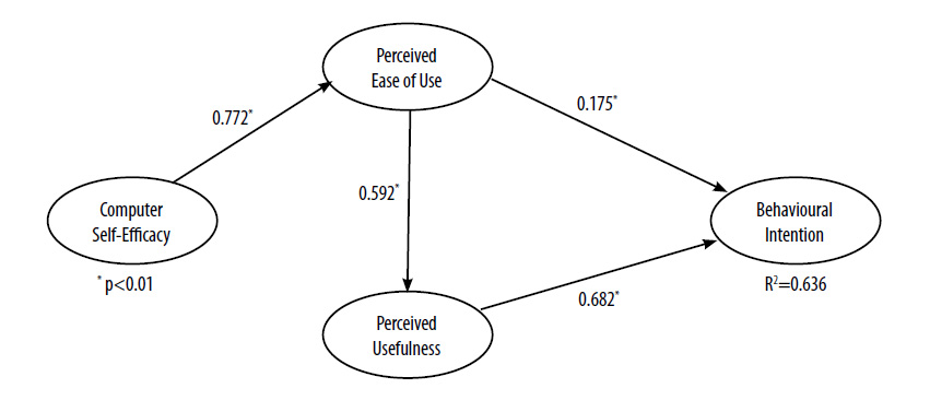
A bootstrap procedure with 1,000 resamples was used to test the statistical significance of the path coefficients in the model. The results for the hypotheses are summarized in Table 4. PU has a significant direct positive effect on BI. Moreover, PEOU is a determinant of PU as well, while CSE is a strong determinant of PEOU. Thus, all the hypotheses were confirmed.
Table 4. Hypothesis testing result
|
Hypothesis |
Path |
Path coeff. |
t value |
Results |
|---|---|---|---|---|
|
H1 |
PU->BI |
0.68 |
5.94 |
Confirmed |
|
H2 |
PEOU->BI |
0.18 |
4.38 |
Confirmed |
|
H3 |
PEOU ->PU |
0.59 |
5.24 |
Confirmed |
|
H4 |
CSE ->PEOU |
0.77 |
11.54 |
Confirmed |
Additional to the direct effects, the structural model also includes indirect effects (Table 5).
Table 5. Hypothesis testing result
|
Dependent Variable |
R2 |
Independent Variables |
Direct effect |
Indirect effect |
Total effect |
|---|---|---|---|---|---|
|
BI |
0.64 |
PU |
0.68 |
|
0.68 |
|
|
|
PEOU |
0.58 |
|
0.58 |
|
|
|
CSE |
|
0.45 |
0.45 |
According to the GoF measure, the model explains almost 64% of the variance in BI (Table 6). These results are summarized in Figure 9. This figure illustrates the path coefficients for all initial hypotheses of the research model. It also depicts the overall variance (R2) explained by the proposed model for BI to use the proposed visualizations.
Figure 9. Path coefficients of the research model
7. Discussion
In this study, we present the results from our experimentation during the development and evaluation of Temporal Learning Analytics Visualizations (TLAVs). Our research is based on reported results regarding a) the capabilities of temporal data to explain students’ behaviour during assessment procedures and b) the frequency of tracking and logging temporal data for visualization purposes.
For the purposes of our study, we followed a design-based research methodology consisting of two iteration cycles. During the first cycle, we collected the requirements and explored usability concerns regarding the design of the suggested visualizations. Twelve Secondary Education teachers were asked to indicate those characteristics that they considered necessary, useful, and easy to understand and interpret. We next embodied the identified learning-specific characteristics into the TLAVs. During the second iteration cycle, we asked 32 Secondary Education teachers to evaluate the proposed visualizations, according to the LAAM. All hypotheses were confirmed and it was found that the effects of PU and PEOU on BI are both strong (0.68 and 0.58, respectively). Further, we explored the effect of CSE on BI as an extension of this model. It was found that CSE has a strong indirect effect (0.45) on BI to use the learning analytics visualization tool.
The results of this evaluation phase showed that the proposed TLAVs are perceived as well designed, since almost 64% of the users claimed that they intended to use this type of visualization in the future. Moreover, most of them believed that TLAVs were perceived as useful and easy to use. These findings are encouraging, shaping a trend to integrate TLAVs in assessment systems in order to support teachers’ awareness of the class’s and each individual student’s progress.
These results are in keeping with reported results from other related works (e.g., Ali et al., 2012; Govaerts et al., 2012). Indeed, they strengthen those results and further suggest that visualization of time spent on assessment activities could be adopted to help instructors interpret them intuitively and perceive hidden aspects of these data quickly.
Finally, given the larger sample size of our study (32 participating teachers), we anticipate that the findings from our study have a higher degree of validity than previous research on the related topic (e.g., Ali et al., 2012; Govaerts et al., 2012).
Currently, the TLAV tool is integrated into the LAERS assessment environment, but, due to the simplicity and commonality of the tracked data, it could be embedded in any learning environment. As a next step, we are planning to evaluate our approach with students, during an assessment procedure. We want to explore whether TLAVs are able to assist students to self-monitor, self-manage and self-reflect during assessment, and whether this mechanism has an impact on their overall performance.

